Energiedirect.nl is relatively new but already a serious competitor on the Dutch energy supply market. With their focus on mainly online client interaction, it is crucial to continuously improve their digital channels. As growing their customer base is key, one of the most important channels to improve is their website, the acquisition channel.

Data & design driven analysis
During my time at Energiedirect.nl I carried out a full analysis of their website. This included surveying the available data, getting to know the different objectives, customer journeys and examining the design choices per device. I reached out to the customer support department for all the current topics and worked closely together with different marketing specialists to pin-point the possible focus areas.
From analysis towards continuous testing
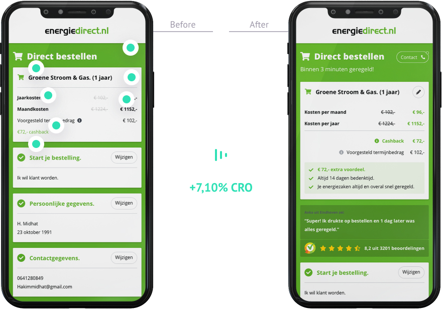
After my analysis, I presented my findings to the board to brief them on my plans to validate my assumptions. While I worked at Energiedirect.nl I set up a variety of tests. These tests included different optimisation assumptions, focussing on the check out process and multiple pages while using quantitative artificial intelligence techniques and A/B testing. With these tests combined, I reached an improvement of 7,10% in conversion rate based on total traffic volume.
Creating an easy to use design system
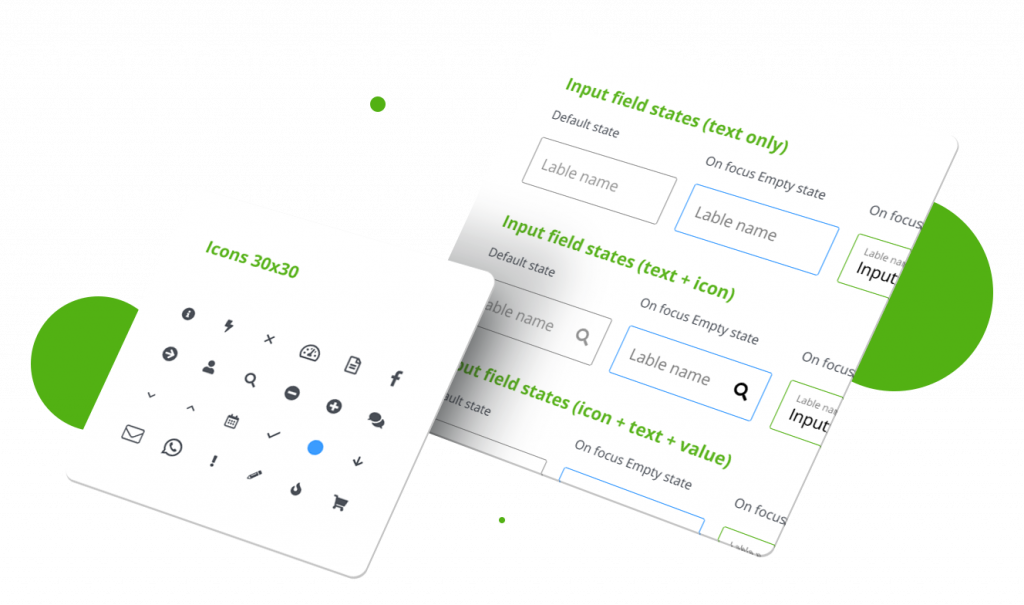
My findings suggested there wasn’t a clear design system for people to work with. The site lacked consistency. After alignment with the team, I set up a design system that is easy to use, not only for designers but also for other marketing specialists and copywriters in different departments.

Restructurer site navigation
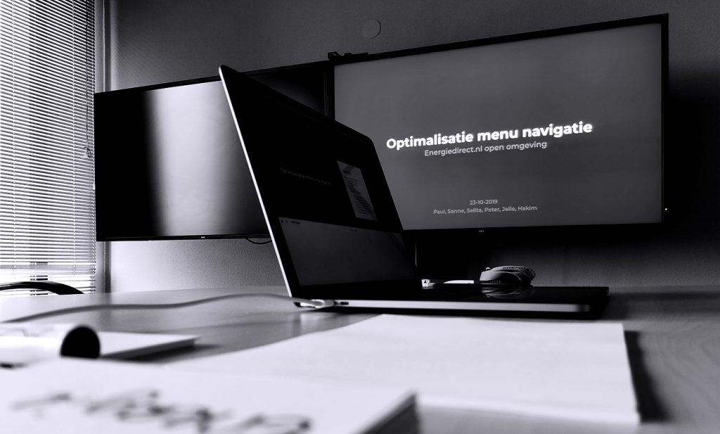
One of the bigger projects was improving the site navigation. I held multiple workshops involving different departments to co-create new site navigation concepts and set up a strategy to validate the various concepts.

